Webex Teams Evaluation
Jump to: Methods & Tasks Data Analysis Findings Conclusion
The Situation
For my 10 week Usability Studies course, three students and I were partnered with Cisco Systems to help evaluate Webex Teams on iPad. I took on the role of researcher and project manager. Our stakeholder at Cisco was a designer who explained that Webex Teams has recently been launched on iPad and no evaluation had been done yet. Additionally, our stakeholder explained that iPad users were very important as users were C-suite executives and influential business decision makers who were taking meetings while on the go. It was critical that these users had a positive experience.
What we were testing
After completing a cognitive walk, through the team scoped the project to focus on the ad-hoc meeting experience in Webex Teams on iPad.
Research Objectives
Improve Webex Teams application on iPad
Establish benchmark for Webex Teams on iPad
Research Questions
How easy is Webex Team to use?
How closely does Webex teams match user expectations?
What are the challenges that users face when using Webex Teams?
Participant Recruiting
Since it was not viable to recruit C-suite executives given we were offering $5 Starbucks gift cards and did not have access to this niche group, we recruited on the following criteria:
Experience with collaboration tools
Comfortable with technology
Working professional
Methods & Tasks


Testing Environment
Two adjacent rooms at the University of Washington
Sessions were video recorded
Team debrief immediately following each interview
I conducted 2 interviews and took notes for 2 interviews
Data Collection

Data Analysis

Qualitative Data
I led the team through the data analysis process beginning with qualitative data. We each focused on the interview(s) we had taken notes for and wrote five key take aways on sticky notes. From there we began an affinity digram where items were initially groups by task. It was clear that the screen sharing was a prevalent and major issue.
After taking a step away and reflecting for a couple days, I was excited to have identified four problem spaces that each of the issues identified could fall into.

Quantitative Data
Satisfaction of Ease and Time on Task
Next, I created charts to visualize all of our quantitative data. Our quantitative data supported qualitative data showing that screen sharing was a major pain point for users.

Time on Task: Pro User vs Participant Mean
Time on task for the pro user data was captured by a team member timing themselves completing each task.

Task Success / Failure
Overall participants were able to complete tasks. The biggest issue was again with screen sharing. Only one participant was able to successfully begin screen sharing.

Qualitative Overall
After tasks were completed participants were asked what three adjectives they would use to describe Webex Teams.
“Confusing because a bunch of things I had expected to be really easy and had been easy in other similar programs were unexpectedly hard.”

Quantitative Overall
After completing all of the tasks, participants completed a System Usability Scale Assessment. The average across participants was 57 even with a major outlier of 90. This shows that Webex teams is below the usability average and has room for improvement.

Severity Rating Scale
To help prioritize issues the team came up with a scale we could use to rate each task.

Prioritization of Issues
The combination of the severity rating scale and frequency of issue was used to prioritize the issues. Highlighted items were the ones which were ultimately presented to the stakeholder. All catastrophic and some major issues were presented.
Findings
1. The system doesn’t match the user’s mental model

Confusing options list to begin screen sharing
Participants were confused by the list of options they have to begin screen sharing. Three of five participants explicitly stated they were expecting an experience similar to the desktop.
"These (the options) are not really helpful. I don't understand what they meant. I was expecting the Chrome option here. A lot of collaboration tools, you can choose to share the entire screen, or just a window."

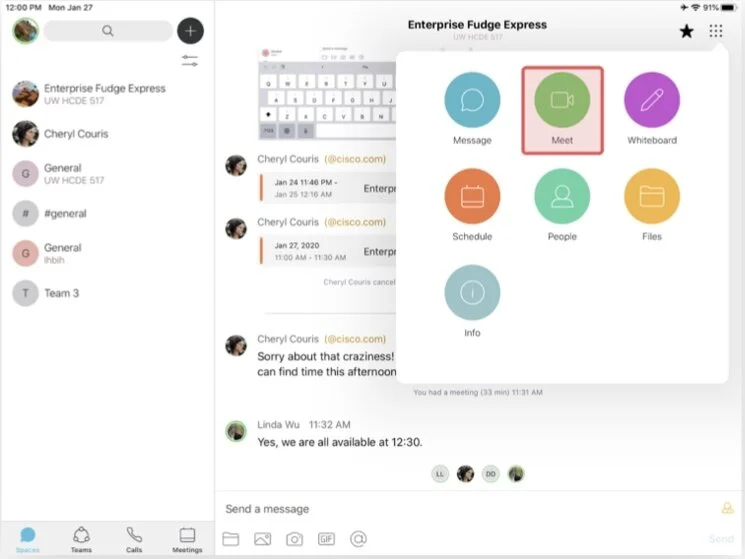
Critical actions are not where users expect them
There was confusion about where critical actions were located. The interface has two menu locations one in the top right corner and one in the bottom on the screen. Some participants expected critical actions to be in the main interface and easily accessible. Others expected to find everything in the menu. When users were working on tasks there was a searching process of going back and forth between the two menus and searching the main interface leading to confusion and increased time on task.

Confusion about how to start a call
All participants began by tapping the phone icon and were confused when that brought the user to a call history page. Participants then began to explore and ultimately 3/5 started the call from the calls history page and 2/5 starting the call from the menu icon in the top right corner.
“I expected an obvious call button instead it was calls history.”
2. Confusing icons and wording

Unclear screen share icon and wording
While for screen sharing 3/5 participants began by checking the top right menu but didn't find it. The screen share icon in the bottom of the interface was not clear as participants said it looked like a multi-task or message icon. After clicking the screen share icon all participants said that the wording "screen recording" and "start broadcast" were confusing.
“There is nowhere that says screen share.”
3. Lacking feedback of system status

Unclear system status while screen sharing
Users were unsure if they were screen sharing as indicators were not clear. Participants expected to be able to have visibility of what was being shared and an indication on the participants list of who was screen sharing as well as a more clear indication that screen sharing had begun.
4. Too may steps to complete tasks

Excessive steps to send a message
In order to send a message participants either have to go to the menu icon or minimize the call screen. Both options result in the user leaving the call interface and entering the message screen. Participants were surprised by this and expected sending a message to be on the same screen.
"I was expecting something I can start typing in the screen (in meeting) instead of going out."
Conclusion
Summary
Successes
Functional
Clean and aesthetically pleasing
Key Recommendations
Fix screen sharing
Screen share icon and wording should be clear
Need clear indication of screen sharing status and what is being shared
allow users to choose which screen/application to share
Put critical actions at easily accessible locations instead of in the menu